On this page I am going to upload the pictures that I took during our photo shoot day and explain the different techniques that I used in order to create images of a professional standard. we used SLR cameras to produce photo's which were effective and suitable for my chosen music genre, images that in some way replicated those on my mock up designs and images that would attract the attention of my target audience. I took into consideration the camera angles, type of camera shot, the lighting, and the mise en scene/background. To create a professional magazine I needed to compose original images that I could use in my magazine. The different techniques that I used include:
- taking pictures from different angles such as medium range shots, low angle shots and close ups.
- adjusting the lighting and the point of focus on some of the images.
- manipulating the body composition of the person featuring in the image.
- Atoning my images to the rule of thirds
- using a variety of settings on the SLR camera
The images that I took during the Photo shoot are all available for me to choose from for my final music magazine front cover, contents page and double page spread. I will use these pictures in Photoshop to make my final magazine pages of which which will all be an improvement upon my mock up designs. I have chosen to use photo shop to do this as by using this application I can manipulate and edit my pictures to look professional in turn making my magazine look very appealing to the target audience.
Rule of thirds Technique

In order to demonstrate my understanding of a variety of different media technologies I needed to understand what an SLR camera is and how I can use the range of features available effectively. Below is an example of the camera that I used:

- Shooting Modes - Aperture Priority, Shutter Priority, and Manual Mode. Each has their own purpose.
- Depth-of-Field – This is a measure of how much of the scene is in focus and is most easily controlled by changing the aperture.
- ISO – This increases the camera sensor’s sensitivity to light, but also increases that amount of digital noise.
- Focus Modes – There’s fixed focus and servo focus, as well as a hybrid mode. Which is best to use depends on the movement of your subject.
- Focal Points – Selecting one or several focus points can help you fine-tune your focusing.
Although this image will obviously not feature in my media product I wanted to document my skills with an advanced digital SLR camera to present how I have considered all the different factors involved when it comes to taking a professional photo. The image displays me taking photos of my model for the front cover image of my magazine.

Main Image Front Cover Model
Portraying Sam Smith

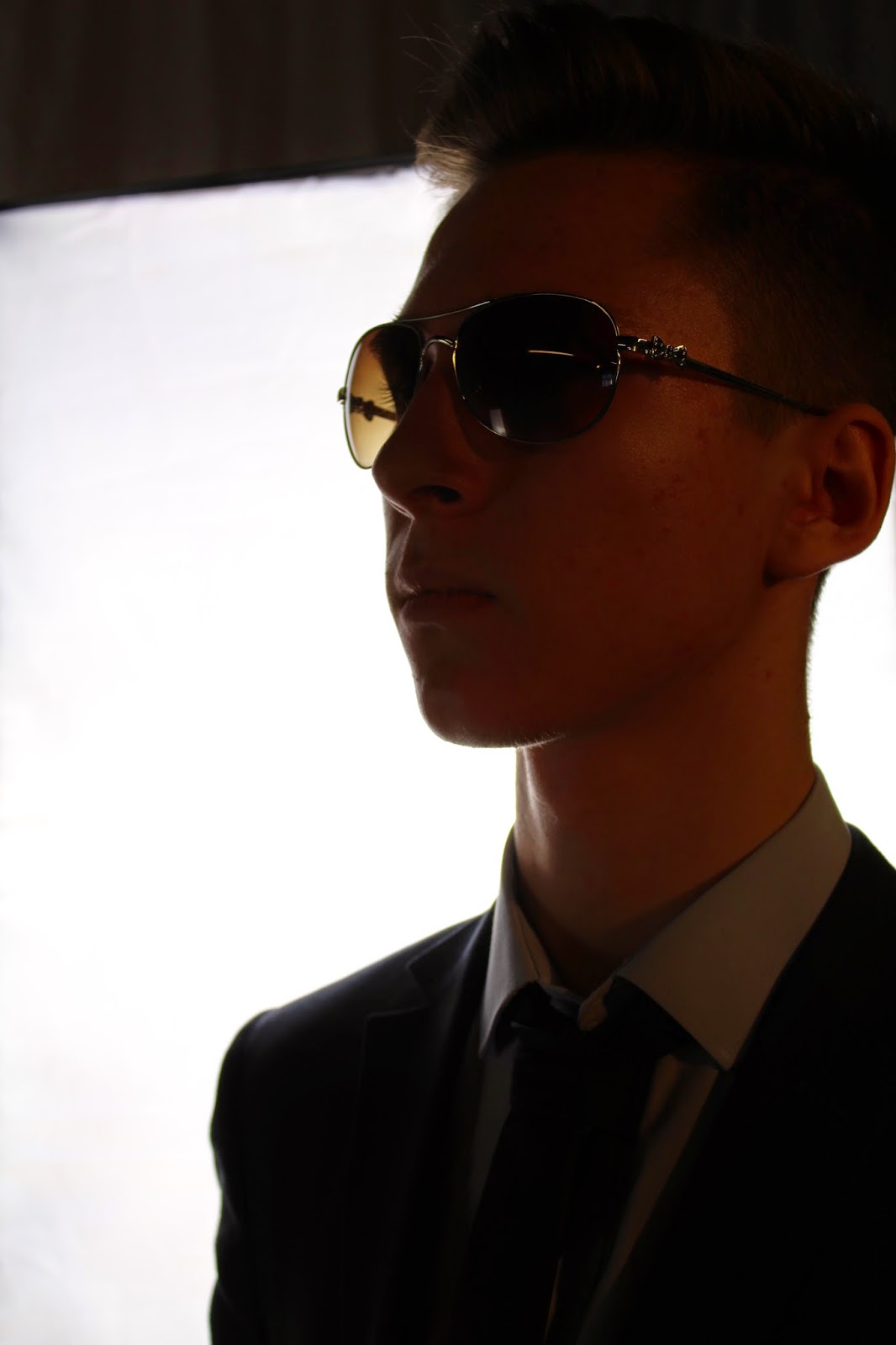
This image in particular is one of my personal favourites as its shows how I have carefully considered the lighting effects and the camera angle. In this image we see the model from a high angle looking down on them. This suggests that the audience will get the opportunity to observe my model and look into their lives acting out a big brother role. I feel as if this image will be best used for an interview scenario as it corresponds with the idea of looking deeper into a persons life with the spot light on them portrayed by the focused lighting which I chose to use in this image. The use of sunglasses in this image could represent how the model no longer wants the attention and exposure that comes with being a famous artist and instead that they want to live a quiet life away from the media. I could also crop the background away from this image and use it for a prize draw competition having the models body sit on the line of a box to show the use of unique image design thus making it more effective to the audience.

This image uses a clear direct mode of address instantly drawing up a relationship between the model and the reader. This close up shot suggests that my magazine will be getting up close and personal with them going into fine detail about them as a person their life, their music and their actions. The some what wry smile that my model is giving suggests that there is a secret to be found out or that they are at a really good place in their career. The sunglasses with the smile assume that the artist is extremely hapy with their position in life or a new song they may have produced. I can see this image featuring on my contents page as part of a singers photo shoot for my magazine. Despite the images composition which allow it to be used as a double page spread I feel as if the background as a backdrop for my main article will not have the impact upon my audience to that of level that I desire.

This image I felt was a great representation of main image for my front cover. It shows the model looking away from camera which makes it instantly clear that this content will be special. It could show the artist as tired and discontent possibly with the media attention on them. The sunglasses suggest that they are trying to hide themselves from the flashing cameras of the media represented by the lighting in the image. The image also shows what my magazine will offer the reader in how it is attempting to put the focus on the model who is so unwilling to co operate with us. This shows intent and desire to give the people the information that they want. As the model is of course not giving a direct mode of address this particular image will not draw in the attention of my audience so I think that it would be best suited on the contents page as a main image surrounded by other similar images which would be overlapping it.

These two images are very similar to the one above however one image has bright lighting behind the model and the other in contrast has low key lighting and the model is out of focus. The first of these images could be used to represent the model as cool and relevant as they are seen wearing shades looking directly to the side with spot light on them. This portrays attitude with the model refusing to look at the camera and instead pose as if they have something else to be interested in. This will intrigue my target audience of 14-21 year old who at this age would also have attitude and confidence in themselves. The second image could be used to represent the state of mind of the model suggesting that they are not focused on their work as a performer or on their career as a whole. The image conveys a lac of conviction or confidence perhaps the result of a failing song release or discontent fans. These two images would be extremely effective a long side cover lines on my front cover page and also my contents page.

This is my favourite image out of all of the images that I have taken. The artist is seen looking down on us showing them in a superior light, they are commanding the image and stealing all of the attention. The empty sky in the background shows that the artist is now the centre of attention and that the light is shining on them and them only. The direct mode of address displays instant power over the audience, immediately drawing them in. This image would be best used for my double page spread as my interview with an artist, this would link in with the idea that the spot light is on them.
Replicated Images that I will use in my music magazine
I decided that it was too easy just to replicate the images used for my mock up magazine and so I decided to manipulate the images to a degree so that I could improve my own skills whilst maintaining some of the mese en scene in which made the images look more appealing for my magazine design and my target audience.


This image shows that I have attempted to replicate the style of the artists and their posture. My model similarly to Sam Smith is wearing a suite and they have their hair in the style of a quiff. I have also tried to replicate the direct mode of address buy differently my model is wearing sunglasses as I felt the found image was too bare. As well as this it shows that they have something to hide which would encourage my audience to read my interview/article with them to find out exactly what it is. This image ideally would be used a front cover.


When replicating this found image it was essential to capture the clothing of the artist. My model is wearing a modern and striking coat with an eccentric hat. I felt the image needed more attitude due to the singer wearing expressive and striking clothing. As a result I presented my model with a gangster like persona to attract my target audience. I did this by dressing my model in jewellery and by getting them to throw up hand signs. For the background I maintained the dark black colour but chose a scratched brick wall instead to make the image more urban and to fit in with the persona my model was trying to emulate.


This replication focuses on the mise en scene in the image. The models are wearing music related products such as head phones which are a fashion accessory that would appeal to my target audience. The electric guitar connotes rebellious behaviour similar to that of my target audience which highlights the type of content that will be in my magazine. My models are holding the microphones in an unconventional fashion as rappers would. The rapper style that I tired to portray in this image is also apparent in how one of my models is wearing a beanie. I have done this to give the image more attitude and to further develop it towards my magazines ethos and target audience.
Toilet tube Images

I think that I will use this image as my front cover image. The tube effect is essential in this image looking professional and in making it effective to the audience. The glistening blue colour effect created by the lens looking down the tube is blurred. This helps to put the focus on my model despite their lac of co-operation when they look away from the camera. The blacked out background is a great effect and as a whole makes the audience feel as if they are seeing the artist from an eye-line match view.

This image is expressive in the postures of the models. two of the models are looking directly towards the camera and two away from the camera. This image could correspond with a reunion story as it suggests that there may have been a fraction within the group that is yet to be mended.
Images focused on personality through posture and stance

The background in this image is bright and colourful and it dominates the image. Any one who sees this will immediately draw to the conclusion that my magazine is positive and relaxing and therefore worth the read. This will appeal to my younger audience who through a stress full time of exams will want to relax and my magazine is the one that will allow them to do this.

This image is one of my favourites. The model is smiling and giving a direct mode of address showing once again that my magazine is positive. As well as this the model is relaxing on a bed reinforcing that my magazine is for people who want to relax and kick back for a bit. This image could go with a cover line stating that an artist is at a good place in their career and that they are more than content with their music.

This image indefinitely portrays attitude. The models are pointing at the reader showing them as aggressive, it immediately draws the audiences attention. The clothing that my models are wearing here are youthful with items such as hoodies, caps and even tattoos to appeal to my young target audience. This image shows my audience exactly who my magazine is targeting showing and that it has clear intent by singling out the consumer. This will encourage 14-21 year old's to read my magazine as it shows my magazine is not being discrete in who it wants to purchase it.
 #
#
Very similarly to some of the other images this suggests that there may have been a fraction within the group that is yet to be fixed as two of my models give a direct mode of address and the other two look away. The suits that the models wear contrast the background of scratched brick wall and general chaos. The one model is looking towards the floor perhaps hinting that the group could be breaking up and that this particular member is not happy about it reinforced by the emotionless faces of some of the other members. Despite the positives I have identified within this image it could not be used as a double page spread because the variation of colour would make it difficult to read the article text I will have on it.

This image looks extremely professional with the all white background giving the effect of a photo shoot studio as well as all of the models standing up straight side by side.

This image shows how I have considered angles when taking images as this is a clear use of a mid shot.


This image shows how I have used different techniques with the SLR camera to produce unconventional professional images for my magazine. Here I used the reflection of a puddle to take a picture of my model. This could potentially partner with an interview where an artist is reflecting back onto their career.

This image shows aggression. Not only does this denote rebellious behaviour to attract my target audience but it also reveals the feelings and the personality of the artist my model is representing.

This image is extremely successful in what I was trying to achieve with it. I wanted my model to be seen as leaving but surprisingly not their career in music, identifiable in the fact that they are carrying their guitar with them. This could suggest that they are joining a new label or moving on to pastures new perhaps considering to preform a different genre of music. The lighting effect in the background portrays the feeling that the sun is setting on the horizon for this artist.

Mise en scene - PROPS

This image is successful in how it shows that model in a superior position and places the audiences from a view where they are on their knees. This image is effective as the audience is seen looking up at the artist.

This reinforces the idea that you can relax when reading my magazine as the artist themselves our seen sitting on a chair with a docile expression on their face.

This image is fantastic in that it looks professional by focusing on a section of the guitar. The focus placed on the strings could suggest that my magazine is all about the music and not the persona's created by the artists.

This image focuses on the cap rather than the microphone. This could convey the idea that my magazine is about the celebrities their lives and their fashion and not so much the music that they preform.

This image would appeal to my target audience. The clothing in this image such as the trendy, colourful shirt and the golden chain shows that my magazine is relevant, trendy and expressive. This would go great as an accompanying image on my double page spread.
Mise en scene - BACKGROUND

I particularly like this image because I believe the background scenery plays a pivotal role in this image. Although this image doesn't necessarily adhere to the rule of thirds, I believe that I can look past this problem as the positives of this image far outweigh the negatives. The scenery just behind the image is perfect for the accompanying cover line. I was contemplating doing a rise to fame, rags to riches style of article and I think that this image would be perfect. The destruction and chaos behind my model portrays the idea of starting from nothing and having to make it on your own in the music industry. What I also think is interesting is the way he is wearing that rather expensive golden chain. My model is almost showing of his achievements and bragging about how he has succeeded in the transition from nothing and becoming a superstar.


Here I adjusted the camera shutter speed so that when my model ,under instruction, wrote their name using a flash light the camera would capture it. This is a superb effect and makes my magazine look professional.
No comments:
Post a Comment